We tested different Facebook posts. Here’s what did well.

Yesterday I shared a lot of information with you about how to make your shares on Facebook more effective, so that you can get the most number of signatures for your Care2 petition. Today I’d like to share some of the information I’ve learned from testing different images and language on Care2’s Facebook shares.
Part of my job includes optimizing Care2’s social media presence, and using tests to find out how petitions can get more signatures. Over the course of all the Facebook experiments I’ve run, I’ve learned a lot — and now you can learn a lot from it, too. Below are four examples of different tests I’ve run and their results. In each example, I’ve chosen a petition that’s doing really well on Care2’s petition site, and then I used Facebook ads to run two different posts alongside each other. I use analytics to see what post performed the best and was most interesting to people.
Here’s what I found:
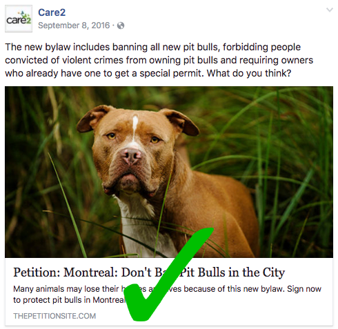
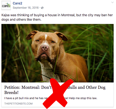
Testing the wording of Facebook post: Pit Bull petition
This petition asks the city of Montreal in Canada to not ban pit bulls. Pit bull bans are discriminatory, breed-specific laws that aren’t based on any real evidence that certain breeds are dangerous — just myths. When pit bull bans are put into place, they rip families and pets apart.
In this test, I wanted to see if focusing on facts about the bans was more compelling to viewers, or if it would be better to mention an individual person and dog owner who would be affected by the ban. Usually we find that personal stories really drive people to care about an issue. But in this case, that didn’t work because what motivates people to care about pit bull bans is empathy for the dogs — so focusing on the dog owner was less powerful. The winning post focused more on the animals than on the person — which makes sense, since this is a petition about animals.
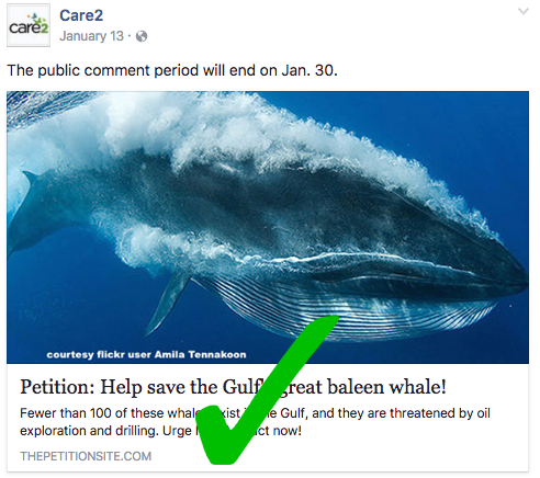
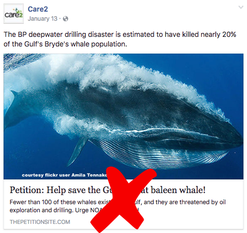
Testing the wording of Facebook post: Baleen Whale petition
In this example, I shared a petition about a critically endangered whale species living in the Gulf of Mexico. I wanted to know if it would be more effective to tell readers how vulnerable these whales were — 20% of them were killed by the 2010 BP oil disaster — or if I should emphasize how little time we had to save them. A public comment period deadline was fast-approaching, which meant quick action was critical.
Both examples show really hard-hitting text that drove many people to sign the petition. But urgency and timeliness won here. Moral of the story: if you have a deadline in your petition campaign, let people know! It will make them feel the urge to act faster and sign now.
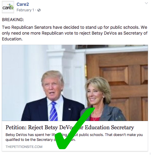
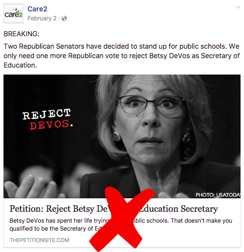
Testing the image for Facebook post: Betsy DeVos petition
In this test, I wanted to keep the text the same but try different visuals to see what would make people care the most. So I used a petition urging the Senate to reject Betsy DeVos’s nomination for U.S. Secretary of Education. I experimented with using an image of her with Donald Trump, and an close-up image of her face with the words, “Reject DeVos.”
In the end, the Trump-DeVos image won. Why? Featuring an image of her with an unpopular and controversial politician was more effective than just having a photo of her on her own, because including Trump provoked an immediate and intense emotional response in viewers. People were also less likely to know who DeVos was on her own, so including Trump was important for the added context.
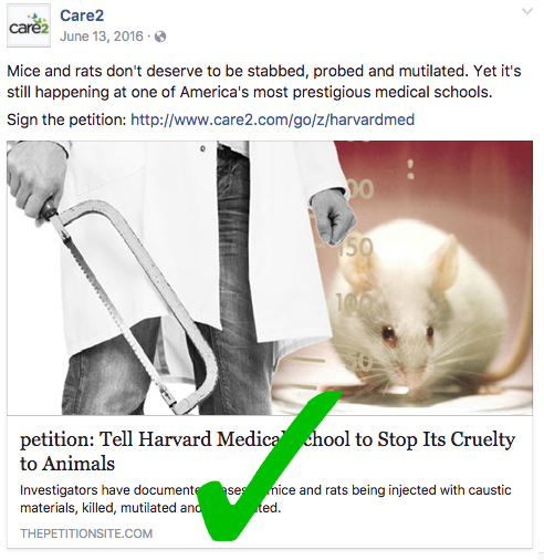
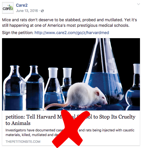
Testing the image for Facebook post: Harvard Med School petition
This one might be surprising! It definitely caught some of my colleagues off-guard.
In this example, I wondered if a cleaner, sharper image would attract more people, or if a slightly messier but more emotional image would work. It’s a comparison of a stock photo versus homemade image, with the added element of professionalism versus dramatic. The first image showcases a laboratory researcher in a white coat, wielding a frightening and grotesque instrument — a hacksaw, the same kind we see in many horror movies. It shows a frightened rat in the background, and the animal is looking right out at the viewer with scared eyes. The different elements were layered using Photoshop or PicMonkey and were pieced together.
The second image is a staged photo. A photographer set up various test tubes and bottles and filled them with mysterious liquid, adding a white rat in front. This image has a lot of things going for it: it’s very clear, has good focus and lighting, and came from a high-quality camera. But the lab rat is looking away from us, and really the bottles don’t look all that frightening on their own. We really weren’t sure how this test would turn out. Usually, we’d recommend a more professional look to your images, but we also know that dramatic images showing someone’s eyes looking directly out are really important. The winner? Emotions!
Have any questions about what works well in Facebook posts? Share them below!
One thought on “We tested different Facebook posts. Here’s what did well.”
Very useful your study.